Why bother with catagorical support?
Catagorical data, like most data, often really needs to be visualized for readability. A standard method to visualize catagorical information is via a bar chart, such as the following:
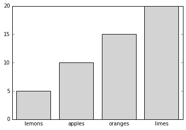
Unfortunately, even a graph this simple requires a matplotlib user to unpack a native data structure in order to create it:
data = {'apples':10, 'oranges':15, 'lemons':5, 'limes':20}
fig = plt.figure()`
ax = fig.add_subplot(1,1,1)`
ax.bar(range(4), data.values(), tick_label=data.keys(),
       align='center', color='lightgray')
ax.xaxis.set_tick_params(size=0)
One of the major aims of this project is to simplify the process so that at the least, the ax.bar call can be reduced to something like:
ax.bar(data.keys(), data.values(), align='center', color='lightgray')
This project aims to encompass more than just bar graphs, and more than just dictionaries; support charts and data structures will determined as the project develops.