Clearly Color Categories
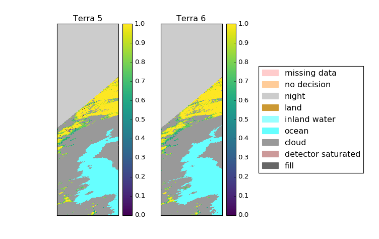
As a grad student, I work a lot with satellite data. This satellite data sometimes has categorical information like whether the pixel is from a broken detector or it’s nightime in that pixel or ocean. Often this data also measures something, and both these things should go on a plot(please forgive the colors):
import matplotlib.colors as mcolors
import matplotlib.cm as mcm
import matplotlib.patches as mpatches

# Create a custom color scheme for the missing value codes
colors = ["#FFCCCC", "#FFCC99", "#CCCCCC",
          "#CC9933", "#99FFFF", "#66FFFF",
          "#999999", "#CC9999", "#666666"]
mcmap = mcolors.ListedColormap(colors)
mnorm = mcolors.BoundaryNorm([200, 201, 211, 225, 237,239, 250, 254,255, 260], mcmap.N)
#make proper legend for the missing data
labels = ['missing data', 'no decision', 'night',
         'land', 'inland water', 'ocean',
         'cloud', 'detector saturated', 'fill']

def plot_fsc(fig, ax, snow, codes):
    cd = ax.imshow(codes, cmap=mcmap, norm=mnorm, interpolation='nearest')
# everything else omitted

patches = [mpatches.Patch(color=c, label=l) for c, l in zip(colors, labels)]
ax3.legend(patches, labels, ncol=1, loc=6)
Even edited such that the non-categorical stuff is omitted, that’s a lot of boilerplate. But, even worse, it’s confusing
as all out because 260 isn’t even in the data but necessary to exploit
BoundaryNorm, which
assigns colors based on lower bound <= value < upper bound. This is confusing enough when the categories are nominally numerical, but it’s even more problematic when the data is numerical. So my [WIP] categorical color pull request aims to simplify the hoops and make it easier to keep track of which colors are attached to what categories. The aim is to be able to create the above image with something like the following code:
import matplotlib.category as cat

codings = [('missing data', '#FFCCCC'), ('no decision', '#FFCC99'),
           ('night', '#CCCCCC'), ('land', '#CC9933'),
           ('inland water', '#99FFFF'), ('ocean', '#66FFFF'),
           ('cloud', '#999999'), ('detector saturated', '#CC9999'),
           ('fill', '#666666')]

cmap, norm = cat.colors_from_categories(codings)

fig, ax = plt.subplots()
sm = ax.imshow(data, cmap=cmap, norm=norm)
ax.legend()
There will also likely be the ability to pass labels into legend in case the data is encoded in integers, like the satellite data. The first step in this has been to develop a CategoryNorm that maps a list of categories to colors directly and doesn’t rely on them being contiguous. This has the added bonus of allowing users to select the categories they care about without having to explicitely create a mask.